In the course of a remodel, plenty of homeowners bring up words such as clean, simple and eco-friendly. But few mean these words as seriously as artist Hadley Williams when renovating the East Bay home she shares with her husband, Ben Williams, and their two children. Those terms became a guiding force in carrying out what turned into an extensive renovation that involved eliminating any known harmful chemicals, using a thoughtfully edited material palette and working with systems that are as efficient as they are innovative. Coupled with a detail-driven and strong aesthetic sense, those goals led to a project that was undertaken as meticulously as any conceptual art installation.
The project began when the couple called on their longtime designer, Sherry Williamson, to update the floor plan of their newly purchased house. “Hadley’s main goal was to create a comfortable, beautiful and healthy home for her family,” says Williamson. Working with builder Michael McCutcheon, the company’s president, vice president Alex Hodgkinson and project manager Mike Roth, Williamson—whose background is in architecture—opened up the layout, relocated bathrooms and created a generous entry hall.
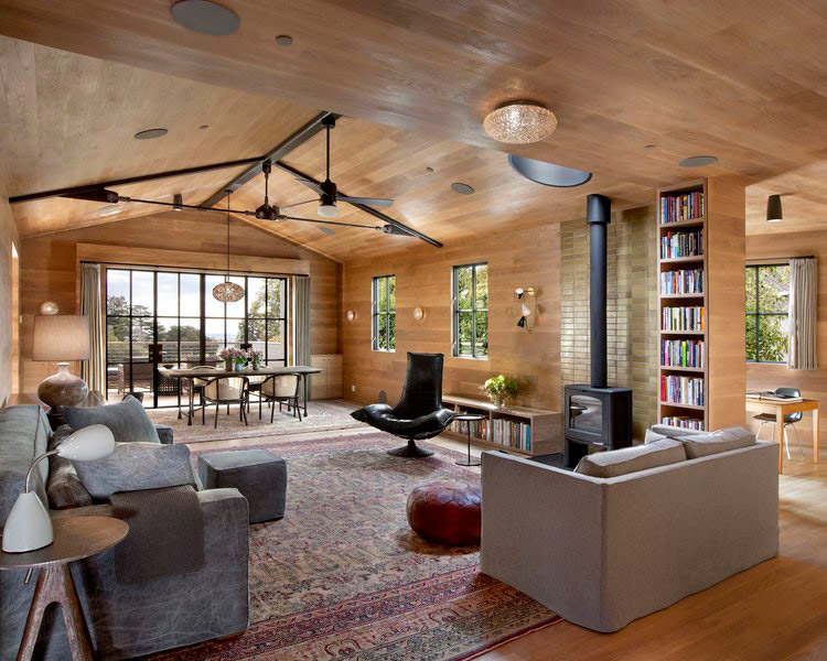
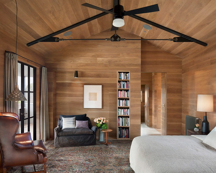
But she didn’t stop there. Hadley envisioned a streamlined aesthetic, with spaces pared down to their essentials. To that end, moldings and wainscoting came down, dropped ceilings were removed, and custom steel trusses went in to support the new vaulted ceilings. From there, the project, the team and the eco-focus all expanded.
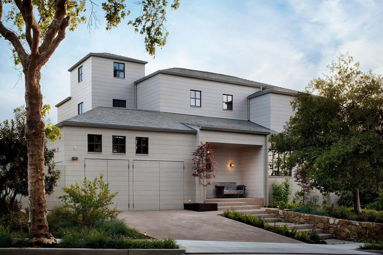
Williamson, who oversaw all of the project’s design work, suggested bringing in architect Andrew Mann to help with the exterior entryway and some interior elements. After Mann was onboard, the windows were tested for air-tightness and performed poorly. Replacing them with more efficient ones provided Hadley with a catalyst to revamp the whole exterior.

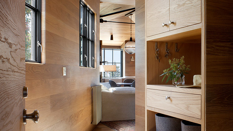
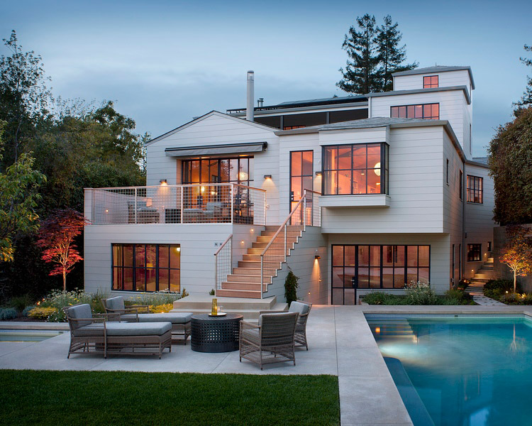
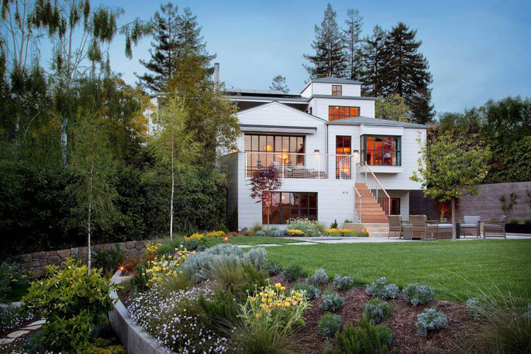
With the addition of landscape architect Scott Lewis, the team proceeded with transforming the entire property. “Aesthetically speaking, Hadley’s top priorities were simple: honesty in construction and clearly presented materials with no applied ornament,” says Mann, who reimagined the exterior with painted horizontal cedar cladding inspired by a pared down, crisp version of New England’s clapboard houses.
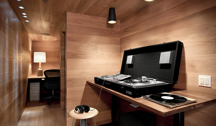

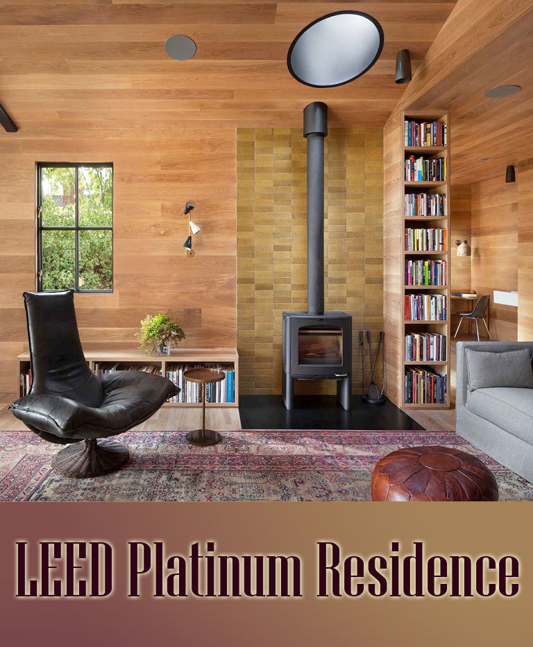
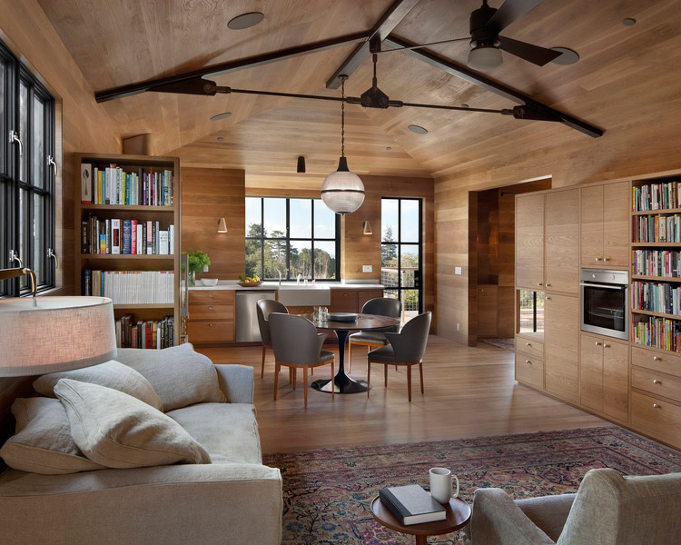
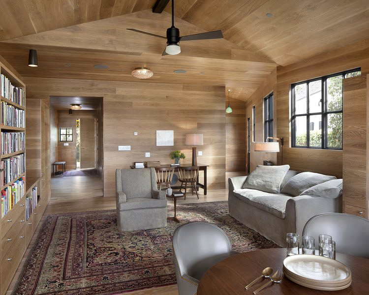
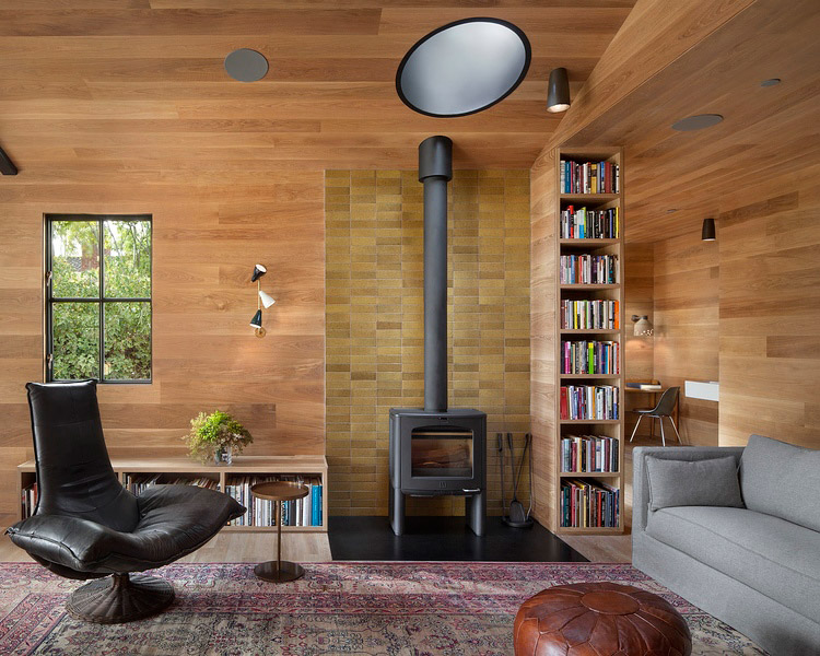
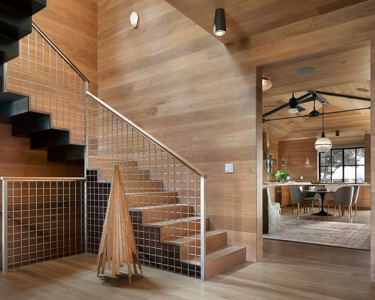
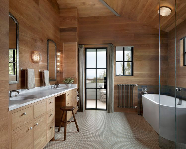
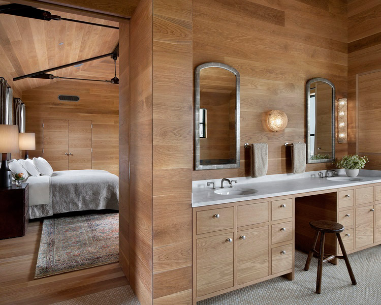
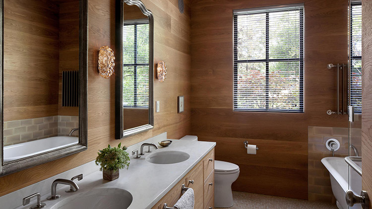
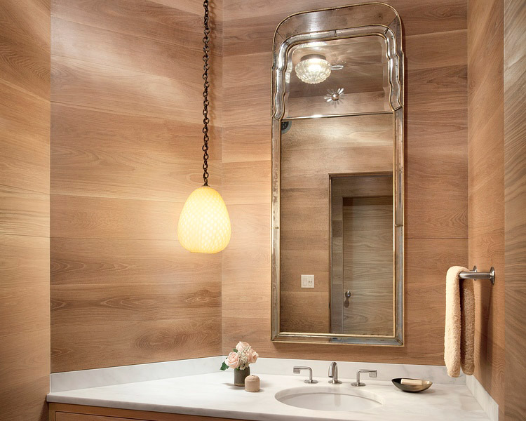
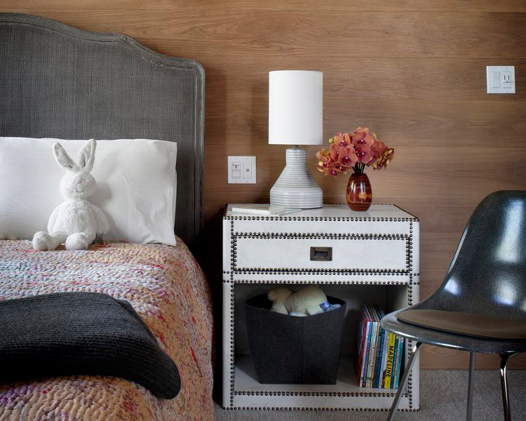
That sensibility works in concert with the FSC-certified American white oak that the team used to wrap the floors, ceilings and walls of the newly quieted interior shell. “Hadley didn’t want us to use any Sheetrock,” says Williamson. “We wanted a material that could be exposed and honest.” Working closely with Hadley and Williamson, Mann developed an intricate random looking pattern for the horizontal oak boards that repeats on the walls of each floor and accommodates light switches, outlets, door heads and countertops in exacting positions.
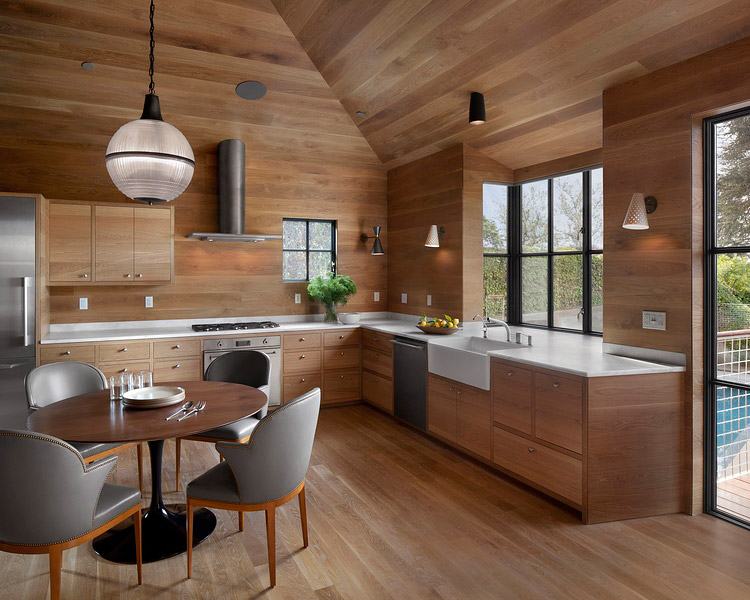
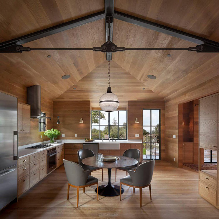
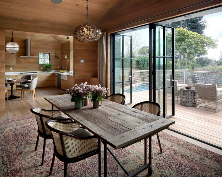
“In my art, I explore the integration of contrasting elements such as machine-made and organic, linearity and roundness, perfection and imperfection,” says Hadley. “This is carried over to the design of the house, as well. The oak paneling is a prominent linear element that is meticulously detailed without trim, yet it’s full of curvy grain elements and unpredictable knots.”
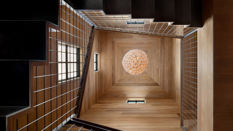
Including the oak, the house has a precisely curated material palette of just a dozen finishes. From glazed-brick tile backing the living room’s new highly efficient wood-burning stove to the same honed marble repeated in the kitchen and bathrooms to the blackened and stainless steels for the trusses and railings, respectively, all of the materials were chosen for their natural beauty and durability. Furthermore, no materials will require toxic chemicals for maintenance.
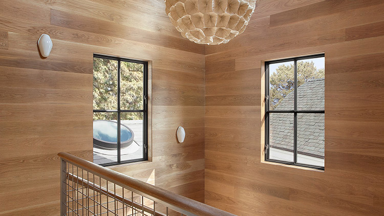
The furnishings offer another study in restraint and contrast. Each room has only the necessary pieces, but Williamson combined vintage and contemporary furniture with intricately detailed antique Persian rugs for a complex composition. In addition to the rugs, light fixtures—including amber glass fixtures and sleek downlights custom-designed by Hadley and Williamson—lend an organic touch. “We continually edited out as many elements as we could,” explains Williamson, “so that the end result would be as visually simple as possible.”

And in keeping with the rest of the house, she had the newly upholstered furniture filled with pure wool or natural latex foam. The same dedication to sustainability continues to the parts of the house you can’t see: Plumbing fixtures were special ordered to eliminate the use of PVC or lead that might contaminate the water supply, and an underground rainwater cistern was put in to capture all runoff water. The builders installed solar panels and created a passive solar water heater on-site with radiant copper pipes that zigzag just beneath the slate roof tiles.
“We include green features in all of our projects with respect to energy efficiency, clean air and durability,” says McCutcheon. “Hadley understood what it takes to build the
healthiest possible home, and that was unique.” Those efforts were rewarded with the house being certified LEED Platinum — the U.S. Green Building Council’s highest ranking. “The house performs really well,” says Hodgkinson. “What makes a project like this a success is the team. It’s when everybody feels they can bring their years of experience to problem-solve.”
Surrounding the structure, Lewis transformed the property with concrete patios and pathways defined by a water-washed finish. “On this type of project, it’s all about the details,” says Lewis. “Hadley has a very fine eye. No matter what the material is, she cares how it looks and how it’s connected to the adjacent materials.” As Lewis handled the property’s site plan and hardscaping, landscape designer Stefani Bittner selected the drought-tolerant and edible plantings. “We believe in creating beautiful gardens that provide harvest,” says Bittner, who executed the project with colleague Christian Cobbs under her former company Star Apple Edible Gardens. Now, the overall effect of the home perfectly resonates with the owner’s artistic aesthetic. “Her work is abstract,” explains Mann. “It’s quiet and deceptively casual-looking yet very rigorous and balanced. She took that same vision to this house.”
House Details
Style: Contemporary
Photography: David Wakely
Home Builder: Michael McCutcheon and Alex Hodgkinson, McCutcheon Construction
Architecture: Andrew Mann, Andrew Mann Architecture
Interior Design: Sherry Williamson, Sherry Williamson Design Inc.
Landscape Architecture: Scott Lewis, Scott Lewis Landscape Architecture
Landscape Architecture: Stefani Bittner, Homestead Design Collective

Leave a Reply