Tips for Decorating Home with Color
Decorating home with color reveals quite a bit about a person. Right now, you’re probably wearing your favorite hue – taupe, lavender, pink? Studies have shown that color, in every aspect of our lives, affects us emotionally and physically.
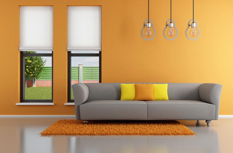
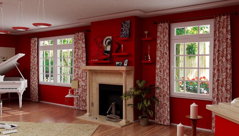
Orange, for instance, stimulates the appetite. Don’t be surprised if you find yourself feeling hungrier in a kitchen or a restaurant that’s painted the color of your morning juice. People tend to be more “up” in red rooms, more subdued in those that are blue. Hospital rooms are often painted a pale, serene green, a shade of well-being.
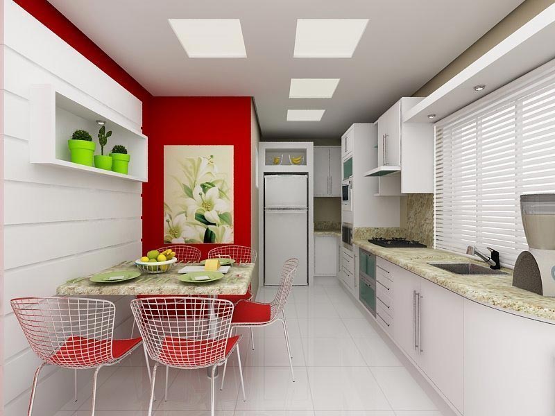
With color you can manipulate the proportions and mood of a room, making it seem smaller or larger, loftier or more intimate. On the whole, rooms washed with an abundance of natural light are best painted either white or a pale color; darker rooms are more attractive in a rich, warm color.
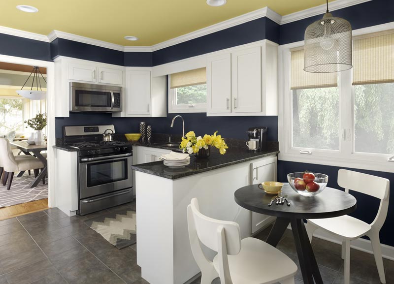
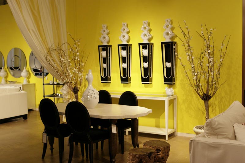
No light in the kitchen? Buttery yellow walls can bring in the sun. Have an upstairs hall that’s too long and too narrow? An end wall painted a warm marigold color will dispel that gloomy corridor feeling forever. Tones of sand and blue-gray together are like a day at the shore. Dazzling jewel tones add brilliance. Historical colors such as ochers, reds, and blues (Williamsburg blue being at the top of the charts) conjure up period backdrops.
All that said, color can often seem the most confusing aspect of decorating. Overwhelmed by hundreds of choices, you have probably forgotten that, unlike lots of other elements you may not be too thrilled with like the tiles on the floor or the shingles on the roof, the wrong color paint is easily remedied. If you don’t like it, pick up the brush and try again. Rather than be intimidated by color, use it to forge rooms that make you happy every single day.
Whirling the Color Wheel
You’ll feel more confident if you understand how colors interact with each other. The physicist Isaac Newton developed the first color wheel way back in the 17th century when he was studying the effects of a beam of light shining through a prism.
The color wheel, consisting of 12 colors, is the prismatic spectrum of rainbow colors set forth as a circle. The three primary colors – red, yellow, and blue – are spaced equally around the wheel. The secondary colors – orange, green, and violet – which are created by mixing two primaries in equal amounts, are set between them. Tertiary colors – colors such as yellow-green, blue-violet, and red-orange – are an equal blend of a primary and a secondary color and make up the remaining half-dozen colors.
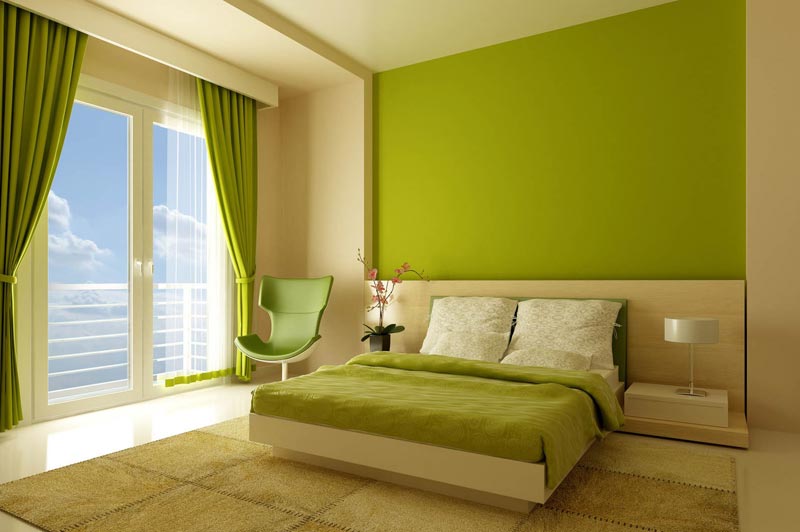
All the other colors outside of the wheel are variations of those 12 colors mixed with white or black or each other. When white is added to color, it creates lighter values called “tints.” Adding black or gray to a color forms darker tones called “shades.” Celery is a very pale tint of green, while avocado is one of its shades. The term “tone” refers to the value, or intensity, of a color.
Artistry
Some of the most successful decorating themes occur when colors of equal intensity or strength are combined; for example, pastels such as pinks and peaches that have a similar lightness or vibrant hues of red, yellow, and blue that share the same depth. If it’s zing you want, combine two complementary colors; they’re “complementary” because they lie directly opposite each other on the wheel.
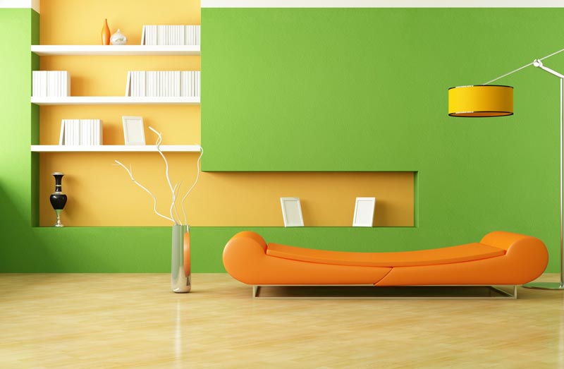
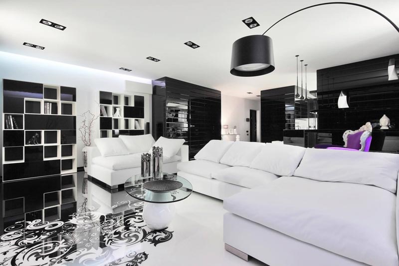
Red and green, for example, are popular partners often found in high-style country rooms. For heightened drama in a stark modern setting of glass and chrome, a less-familiar union would be a purple sofa littered with plump yellow pillows. A color will clash with the colors to the right or left of its complement on the wheel, for instance apricot with purple-blue. Still, not all clashes are bad news. Modernists often pair colors like bright yellow and royal blue successfully.
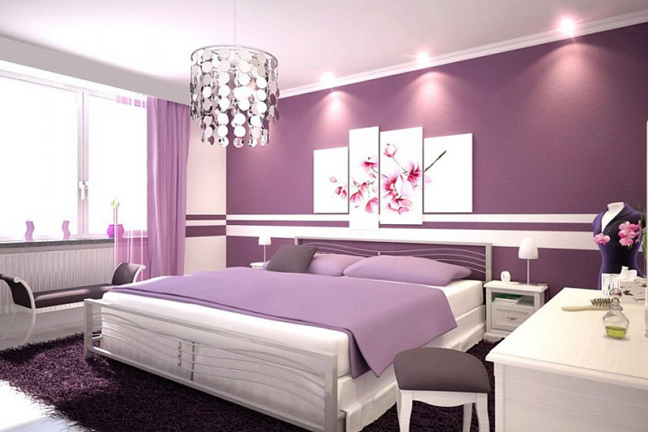
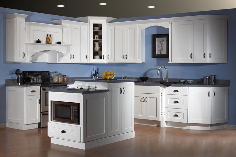
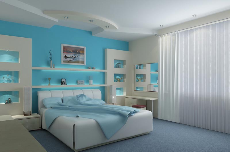
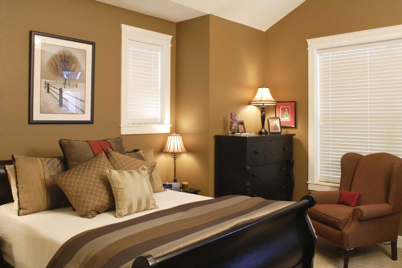
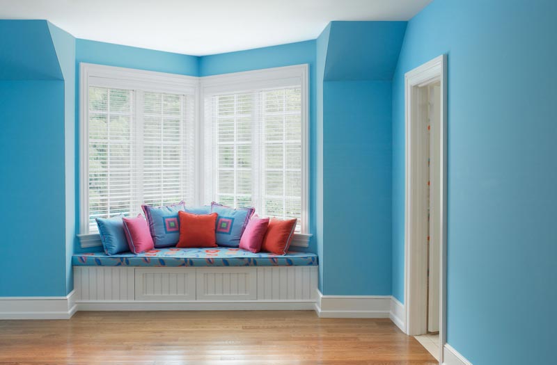
Cool colors – like green, blue, and violet – will make your living room appear larger because they seem to push the walls away. Warm colors – oranges, reds, yellows – do the reverse. Paint your bedroom a charming Tuscan apricot, and the space will feel marvelously cocoonlike. A dark color will add mystery and romance (on a practical note, dark rooms also remain cleaner-looking longer). A color plan that includes any three consecutive colors or any of their adjacent tints and shades will zap the room with life. Gardeners often follow an analogous scheme in their flower borders with waves of fiery red melting into drifts of orange and yellow or, the opposite, red blooms flowing into crimsons and violets.
Soothing monochromatic themes utilize one color like blue or gray in a variety of tones or gradations. Smoke-colored walls, silvery velvet drapes, and a dark gray sisal carpet on the floor of a New York apartment affords the owner the feeling of living on a cloud. Want to know all your choices for, say, a green scheme? Paint manufacturers have made it foolproof with chips and charts that follow every color’s logical progression. To ease our bewilderment, handy aids such as large L-shaped chips exist to judge trim colors and flip charts of suggested color combinations. Some stores even rent pints of a paint for a minimum fee to ease the process along.
Think of your background color as a plate on which you are presenting all the other elements: furnishings, accessories, art. An accent color should be the garnish (the green parsley or the bright red cherry) you place on top. If you appoint a color like cobalt blue or plum as your accent color and adhere to a neutral palette, it will be much easier to shift moods or to alter the look of a room according to season with throws, rugs, cushions, pillows, and slipcovers. A pearly colored living room? Come winter, swap lime-green sofa pillows for chocolate-brown. A bright-white-tiled bath? Hang up navy-colored towels as a nautical nod to summer in lieu of red (too winter holidayish). Colors, like fashions, tend to follow the fads. A neutral palette, however, will never look like yesterday’s news (think of 1950s pink), an important consideration if you are someday going to place the house on the market.
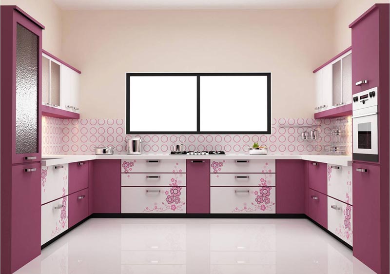
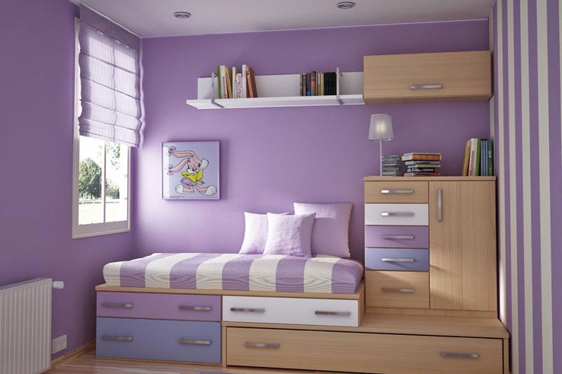
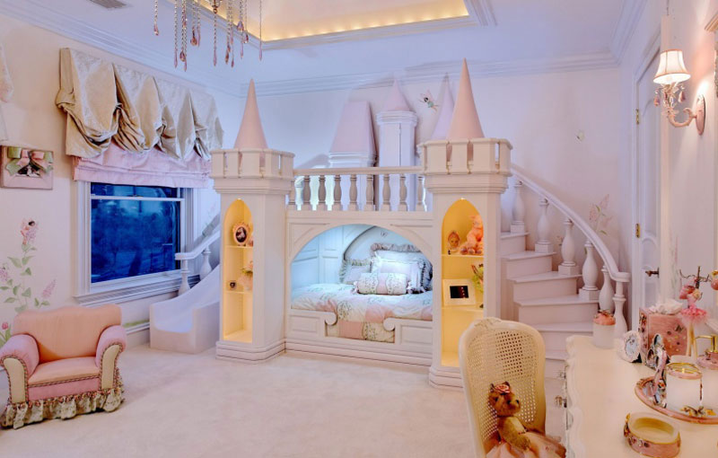
Kids love color and the more colors the merrier. Kids’ artwork is proof. And today there are any number of freewheeling colors based on crayons along with awesome special-effect finishes like glow-in-the-dark paint and glitter. Forego the ubiquitous pale blue and pink for something newer like luscious peach or pale lavender, the color of morning mist. Still, if you’re looking to keep the same recipe for a number of years, neutrals such as creamy ivory or pastels will adapt best for them as time goes by and they mature.
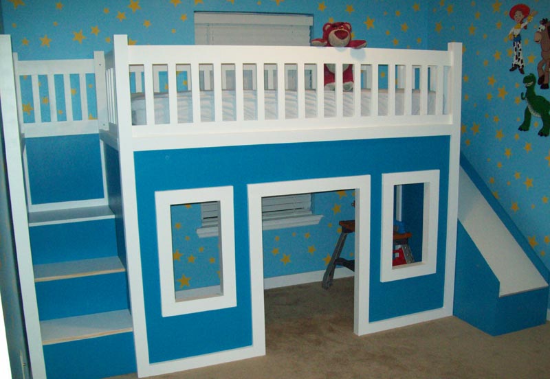
Let playful furniture in primary colors be the high jinks for a young child. In an older child’s space, one color used on all the furniture (white, cornflower blue, or buttercup-yellow) will give the room a tidier, more uniform feel. Rather than installing walls, you could use different colors to designate different areas: Paint the study zone bright green; put restful moss wallpaper behind the bunk beds.
Children appreciate being included in making the decisions regarding their rooms. Rather than confront them with a zillion choices, though, narrow it down to three or four colors you think are appropriate and then let them choose.
Unbeatable White
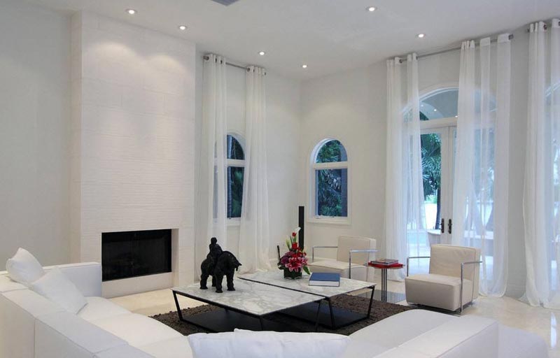
White or off-white is a timeless background upon which any style can be superimposed. In the 1920s, Syrie Maugham created an all-white drawing room in her London home that became a landmark in the world of interior design. White can be elegant as in an ultramodern loft or homey as in an all-white beach cottage. White unifies a small space. Paint the floor white as well as the walls and windows, and a tiny room will feel more open. Add snowy window treatments – a roll-up shade of white denim, white shutters, or celestiallike white shears – and expand the setting still farther.
Contrary to what you might think, white is not boring. Sun-bleached seashells heaped in a bowl offer a host of variations. Follow their cue, and combine several different tones of white: Paint the ceiling a bright, wake-up white; color the walls a more forgiving creamy-white; and dress the chairs and couch in slipcovers of natural cotton. When you need a punch of color, add a bouquet of flowers.
The Final Decision
Tote home a handful of paint chips or strips in the same color range, and tack them on the wall. Observe how they are affected by continuously changing natural and artificial light. White daylight is made up of all the colors of the spectrum. The color of your walls will depend on how much white light is reflected and how much is absorbed. Switch on a lightbulb that does not have the same balance as the spectrum, and you might notice a more blue or yellow tint.
When you have finally selected your colors or whittled it down to one or two, paint them on a wall and live with them for a couple of days. It will help if you paint a large area rather than just applying a puny dab. If the color seems too dominant, switch to a lighter value on the paint strip. If you’re still undecided, trust your instincts. Color is, above all else, very personal. Family and friends aren’t going to judge your rooms in technical terms anyway. All they will know is that you’re content and that your bedroom looks beautiful. In the end, that’s what counts.
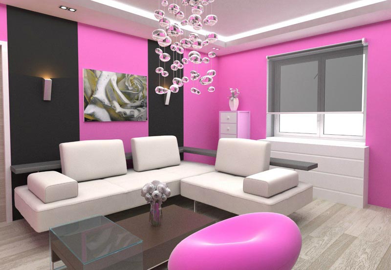
Color isn’t the only thing to make a room pop, however. Texture and pattern offers contrast and spices up an otherwise uniform room. On the next page, learn how to incorporate texture and pattern into your home.





Leave a Reply