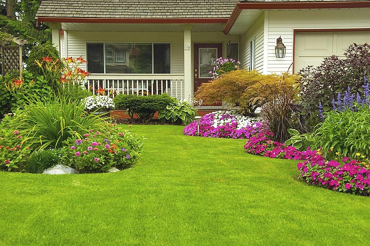
Colors in the garden typically elicits the most emotional response, those gasps of appreciation that are music to a gardener’s ear. And everyone has colors he or she is partial to. But there’s more to working with colors in the garden design than just throwing everything together in hopes of achieving a “Pow!” effect. By understanding how colors interact and how we react to them, you can use them to better advantage in the landscape.
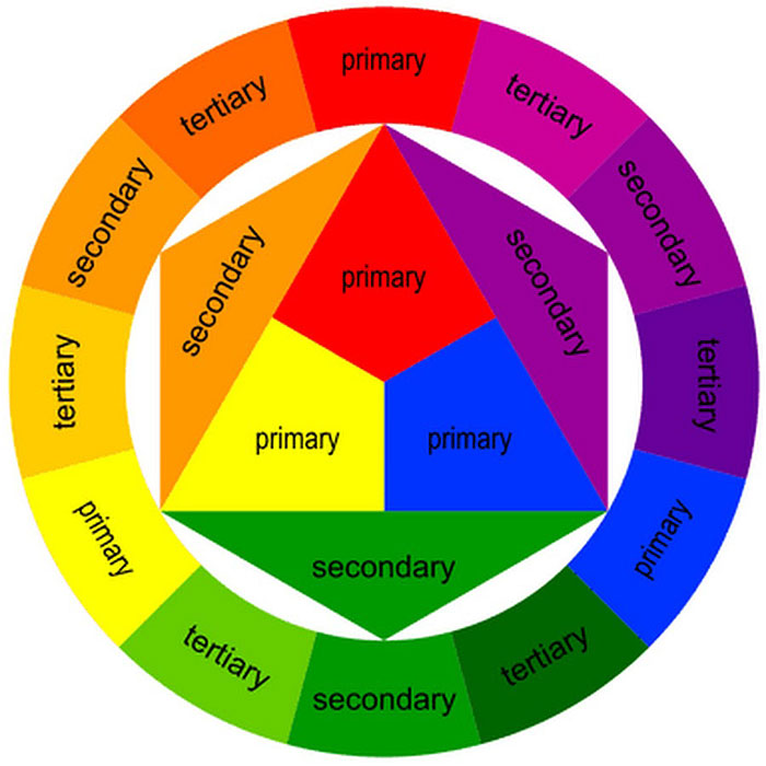
Everyone has seen a color wheel, but here are a few 101 basics. Red, blue, and yellow are called the “primary” colors. By combining these we get the “secondary” colors of orange (red plus yellow), purple (blue plus red), and green (yellow plus blue). Amazingly, combining just primary colors, black, and white can create every hue imaginable.
Colors opposite each other on the wheel are said to be “complementary” (red and green, blue and orange, purple and yellow). Putting these beside each other in the garden lends a lot of punch. For example, purple salvia planted with yellow coreopsis has big impact, while the salvia might almost disappear beside a lavender. It works best to have more of one complementary color than the other, so the two aren’t duking it out visually. In other words, use a few salvias with a mass of coreopsis, or one nice coreopsis against a larger group of salvias.
Colors next to each other on the wheel are “analogous” (red/orange/yellow, blue/purple/green). Using these together can be very harmonious. Red, orange, and yellow are called “warm” colors for obvious reasons – think sunshine and fire. These colors are exciting and make our heart rates go up. Conversely, a combo of blue, purple, and green, which are called “cool” colors, is peaceful and relaxing.
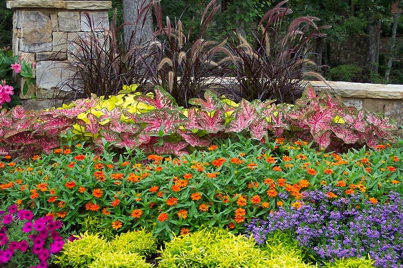
So, if you want a border with a lot of energy, try black-eyed Susan, coreopsis, gaillardia, red-hot poker, poppies, butterfly weed, and daylilies. For a soothing effect, look to delphinium, hydrangea, cornflower, pincushion flower, lavender, and angelonia. While most people think of flowers first for color, actually foliage, fruit, and bark can bring a lot of color as well, especially if you want to extend the season.
A few words of caution: A garden loaded up with warm colors can be jarring, and too many cool ones can be monotonous. Use white sparingly: It draws the eye even more than hot colors do and can be distracting. And be sure to provide places for the eye to rest. One way to do this is to break up masses of flower color by allowing foliage to show through and not have everything in bloom at the same time.
To really make things interesting, interplay warm and cool colors. Such as sweeps of cool colors interspersed with smaller groupings of hot colors as focal points, or masses of warm colors with soothing moments of blues and purples among them. In the landscape warm colors seem to advance toward us, which is useful if you want to bring the back of a deep border more up close and personal, or draw the eye to something at a distance. Cool colors seem to recede in the landscape, which can be used to make a bed seem larger.
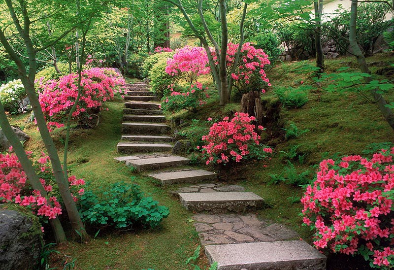
Also, take note of any “color echo” opportunities. For example, the peach-colored petals of African daisy encircle vibrant purple centers, which can be echoed by purple verbena. Or repeat a color using different plants, such as tulips and dianthus, both in pastel pink.
The goal is to have the garden look like it’s in communion, not discord, whether your penchant is for panache or subtlety. And your personal taste is important. Just don’t let it narrow your options. Even if you think you don’t like yellow, keep in mind the benefits yellow can have in a garden, and the huge range of yellows!
Other things to take note of when choosing colors for your garden are the colors of your house and hardscaping, and the views through the windows. If you have a lot of red in your interiors, you might not want to look out at hot magenta flowers!


Leave a Reply